Monday, April 26, 2010

Unsuccessful Typographic Solutions


This sign was taken at Venice Beach California on the famous boardwalk. This sign was over a store that sold beach supplies. The sign looked like it was created using spray paint in a modern bold typeface. Also the text was paired up with a scene in the background to give it a beach fun look. I felt that this sign was unsuccessfully because it does not look professional at all and to me it just looks like a piece of art someone created on a side of a building. I would never think that this is a sign for a beach supply store. To me the text is cool, and the sign does stand out in general with the beach themed colors that the artist used, but I would not take the company seriously if I saw this sign above a store. With the text being in a dark color and part of the ocean in the background being dark, it is a little difficult to read the la-la land.

Unsuccessful Typographic Solutions


This graphic or sign was taken in California on Hollywood Blvd. This was not a logo that was on top of a store or anything. This is a logo of a company that has a store, and it was located on the front window before you walk in. First, you cannot read it, you have no idea what it says or what company it is. The text is in a crazy graphic old-style typeface that it is literally illegible. It looks more of a medieval typeface that is just not readable especially in all caps which the logo is in. Underneath the logo looks like initials or two letters together in some way. Even though these two letters are much bigger in size then the other text in the banner, you still cannot tell what letters they are. The logo does stand out though with the text being in white and the graphic in the middle being filled in with white and it being very large. Overall, I do not know what this store represent or sells. You can tell that the stuff they sell might have strong graphics on it so it can be a clothing store but at the same time it can be a tattoo parlor too. If you have many possibilities for one logo, then you know it is not successful.

Unsuccessful Typographic Solutions


This sign is located on Hollywood Blvd. in California. This restaurant is located next to a well known Hollywood signs that is located in the background of the photo. First, the sign is to small. I had to zoom in a lot to even get this in the lens, so this sign was not that legible. The text here that spells out The Green Room, is in a color of green that is hard to read. The text is all in caps and is in a modern more graphic type of typeface. The color washes out the text and with the whole sign being in different shades of green makes it so illegible. The text needs to be bigger in general and so does the size of the sign . You don’t understand that this is a restaurant at first either so what it is representing is hard to read. I feel that text is wrong for such a small size sign, the artist should of choose a sans serif text that was simple and had a thin weight to it.

Unsuccessful Typographic Solutions


Here we have a sign that I took out in California on Hollywood Blvd. I choose to take a picture of this sign because I felt that it was unsuccessful for some reasons. It is to plain and boring. When you have a customer walk by, you will not notice this sign at all because the type is boring and so are the colors. The typeface here is a sans serif more modern type and it is simply in black. I do know that this sign is advertising an athletic store but at the same time what is BS? BS to me would mean bull shit. There is just something missing here to make it stand out, color and a more in depth logo for the company to draw customers in. You first look at the BS and move your eyes to the Athletic. Overall this sign is to boring.

Unsuccessful Typographic Solutions


This sign was taken in California on a random street. The sign reads out Kubar Mediterranean Café. Right when I saw this, I felt that this sign is to much, to much text, to many typefaces and to many colors. First there are three different typefaces here. The first one that spells out ‘Kubar,’ is a serif typeface in all caps. It has an old-style look and feel to it as well. The letters have a round aspect to them. The second typeface is a sans serif type with a modern twist to it. The letters m, e, and d are much bigger size then the rest of the word. The typeface also look handwritten too. The third typeface is a cursive type, with a calligraphic look to it. When it comes to the colors, its way to much. The Kubar is spelled out in orange and the background color is red, which makes it slightly hard to read in general. The Mediterranean is in yellow which is always a good bright color, but the problem here is the stone in the background is almost the same color, so it makes it difficult to read. The café is in orange with a teal square background which makes it hard to read since the stone is the same color as the text, doesn’t make any sense. Overall, the sign is not symmetrical and balanced. Everything is centered but with all of the typefaces, it just doesn’t come together overall as a sign. The messages that we are getting is clear that it is a Mediterranean restaurant, but the look of it is horrible.

Successful Typographic Solution


This sign was taken in California at the famous Rodeo Drive. This sign is successful for many reasons. Right away I know that this is a pizza restaurant. The overall logo is very well put together with the graphics and the type. The type here that reads ‘Pizza Rustica’’ is in a serif typeface that is place on a curve that is centralized around the graphic in the logo, a tomato. The logo is in an overall circle shape with a square in the middle with the tomato. When you first look at this logo, your eyes go straight to the tomato, but with the edges of the square that is around the tomato, it points up and down so your eyes go straight up to Pizza and then down to Rustica. This shows that the logo’s movement and balance is very well symmetrical. The text is in black on a white background, which is always a good combination o make text stand out. The tomato ads a great aspect to the logo since it is a pizza restaurant, it makes it playful and fun to look at. The age group here is everyone, and everyone can easily understand what this place is.

Successful Typographic Solution


This sign was taken in California on the famous Melrose. Posers is a clothing store and when I saw this sign, I thought all of the typefaces work very well together. The types here are typefaces that are drawn out, graphic typefaces. Each letter is different but at the same time, they have a similar aspect to them that balances out the sign. Each except the P, has a curvy line aspect to them and a very sketchy look as well. All of the letters are in white except the P with a black background to them. This classic mix of perfect colors together to make the text stand out, bold. The P is a sans serif type and it is very simple and straight compared to the rest of the text and the P is also in black and then there is a white box around just he P. By the artist doing this to the P, it makes your eyes stare at the P first then you go down the line in movement to read the rest of the sign. The O had a graphic in the middle of it and I am not sure what it is but the overall look of the sign communicates a tough hard look and atmosphere to it. An average person walking by might not know that it is a clothing store, but to me the graphics and type came together and balances each other out for a good composition.

Successful Typographic Solution


This is a Pepsi ad that I took in California on the corner of Hollywood Blvd. The size of this ad is very big compared to normal billboards, so it is noticeable when you drive by. They typeface that is used here is a sans serif type. The ‘do’ is larger then the rest of the words here. The ‘O’s’ are prominent objects here and are filled in with the Pepsi logo. The weight of each letter is bold. The letting between each letter is tight as well, very compact. I feel that it is a successful logo and ad because the overall message and composition works very well together. With the ‘DO’ being bigger then the ‘some good,’ it balances each other out and the symmetry as well is perfect here. If the ‘O’s’ didn’t have the Pepsi’s logo, then I feel this ad would not be successful because people would read the ad and not know what the ad is for right away. With the five colors used here, everything goes very well together. All the colors compliment the Pepsi logo colors. The text is in white which makes it easier to read when it is on a darker background which it is. With the three cans on the lower right corner, it makes the movement and flow of the ad go very well with also the website in the lower left corner.

Successful Typographic Solution


This picture was taken in California on a street off of Malibu. Spacecraft is a full service hospitality design and construction firm based in L.A. The companies philosophy is a combined focus on logical space planning, project unique schemes and leading edge designs. I felt the overall message was confusing of what Spacecraft was, but the design aspect was unique and good. There are three typefaces in this sign. Usually ore then two typefaces in a logo or a sign does not work but here it does. With the word ‘space’ the typeface is more of a bold modern type with some serif’s on the end. The second typeface with the word ‘craft’ is a modern type as well, but the weight of the letters are much thinner then the first type. This gives off the impressions of more letting in between the letters. The third type with the website and phone number, is a sans serif type that is clean, simple and easy to read. The typographic message that the sign is giving is a modern feel, something to do with space and crafts (arts). Before knowing what the company was, the audience here would be young and fresh with an edge. Here, it is in black and white which always works well, black background with white text. The white text stands out well. The balance with the bold typeface and the thinner typeface works very well and brings harmony to the overall logo.

Successful Typographic Solution


This picture was take in California on Hollywood Blvd. It is a sign that the city of Los Angeles put out. This sign is communicating this area of the road is just for loading only. The typeface is a sans serif type that is simple and easy to read. The audience is everyone, for people who understand English, so that is why the typeface is very legible. The color in this sign is black and yellow. The yellow as the background really makes the ‘LOADING ONLY” stand out from a long distance. This sign is all in caps and it communicates that the author wants it to be noticeable rather then hidden. The typeface is also centered and the proportion of sign and the typeface works very well. The size and curve of the sign here works well and is harmonic to the typeface. The typeface is simple but round at the same time which works excellence with the proportions of the size of the sign. The letting here is normal, enough space to have time to get a thought in. The space between the two words works well too with the direction of how you read the sign.

Survey Project

Type is everywhere. In our market-driven society we are exposed to countless commercial messages daily. The typefaces and the varying styles that are used in these messages contribute to the connotations of these messages; sometimes subtly and sometimes in obvious was. This project is intended to train your eye to notice details about the letter-forms you see every day. With my camera, I had to go out in the real world and take pictures of successful typographic solutions (logos, signs, billboards etc.) and unsuccessful solutions as well. The first step was to take 100 photos of unsuccessful and successful. I was in California (Los Angeles) when I had to take pictures and I got lucky because L.A. is full of signs! :) The next step was to pick 15 successful and 15 unsuccessful typographic solutions into a power point presentation with a description next to each image talking about the font, the composition, how it was successful and unsuccessful and etc. The last step was to put all the images (all 30) on a final power point presentation without the descriptions and present it to the class. The challenge was talking about each image without any help. Next, I am going to post 5 successful and 5 unsuccessful typographic solutions with the descriptions.

Friday, April 23, 2010

Project 6- Process Questions

When choosing the typeface for this project, I didn’t just want something simple like others would choose. I went for a serif type that had a little edge to it. Yes, it is simple but at the same time with the serifs at the end, it gives an attitude. I wanted something that would give my hair and the rest of my face a texture and that is what a serif typeface does.
________________
The first couple of steps were choosing the perfect picture. I didn’t want a picture with too much going on, something that shows my face straight forward, also a picture that would show who I am. I choose a picture that gave me a lot of different opportunities to make it something of my own. I did not do any sketches I just went straight for it to the computer. I wanted it to really look like me so I just little letters to fill in everything instead of turning a one letter into my whole eye.
________________
This project was very challenging. It took time to make this and time is hard to come forth to. Making the whole portrait actually look like me was difficult and hard. Individually moving each letter to a certain part of my face was time consuming.
________________
Making my picture into a black and white photo with a filter on it so I can see the shades was something that got me through this project faster than just placing a picture and working on it that way. Also the copy and paste buttons was my best friends. Locking the layer with the picture of my face was helpful as well.
________________
Like I said, I learned a lot about filters and locking them. In general, I didn’t learn anything new but it was helpful learning more about layers in general.
________________
In the end, this project did make me think a lot of using letters and different ways of using letters for a solution. Why use a picture when you can create it with letters? It just adds a more design and creative aspects to anything in general.

Thursday, April 22, 2010

Project 6- FINAL!

Yes the final is here already! There were no roughs or sketches for this project. I just went straight to the computer and created this! ooo and I hope it looks like me! haha


Project 6- Self Protrait with Type

Here is the last project! happy but sad at the same time. So project 6 is going to be a portrait of myself using letters, challenging I know. Using only typographic characters, black and white color palette and it has to be on a 8 by 8 inch composition. Basically in the end it will be evaluated on how well the portrait looks like me. Lets just say, I know before hand that this project will take me a LONG TIME to create! :(

Wednesday, April 21, 2010

Project 5-Process Questions

After already sketching my design out, I realized that I would need a very legible typeface for curvy line design at the bottom half of my composition. I needed a typeface that was a san serif, something clean and neat. For the title, I wanted to use the same typeface as the writing design but also incorporate a more handwriting (natural) looking typeface in the title some how. I used Abadi MT Condensed Light and handwriting Dakota.

______________________

I started looking up some poetry and how a poet arranged the poem they wrote. I really wanted to incorporate an image as well with some sort of flowing text. I can up with four designs that I drew and really only thought about the image and the text more then the title. All the designs had a similar concept and then choose the hand writing text.

______________________

The thing that I found difficult for this project was a way to make the text on a curvy line. Making a curvy line in Illustrator was a lot harder then I thought. I used many different ways and the only way was the hand place every letter on an imaginary line. I first made the curvy line with the pen tool and it just wasn’t coming out the way I wanted to so I took the hard rought and hand made it.

______________________

For this project, I didn’t really find any solutions to help me move through the process quicker. In the end though, I did tell myself that I can not spend hours trying to make something look perfect because it will never look like what I imagined.

______________________

Technically, as I said before, I had some difficulty with making the curvy line. I did learn more about the pen tool as I was using it. I learned how to add anchors and delete anchors as well.

______________________

Positive and negative space was very important in my composition. With the way the hand was positioned with the text, it left me with a very open space up top for the title. I had to consciously think were to place the title and the Lasell logo as well to make everything even with the bottom.

______________________

Harmony- The use of repetition was everywhere in my design. I repeated the curve line of text to make a cool design. I also repeated the typefaces.

______________________

Variety- With the curve line with the text, it created a pattern look to it and it also added contrast to the design since the design is very plain.

______________________

Balance- I tried to balance the curve lines to make a repetitive design. With the curve and shape of the lines, it creates a balance in the page.

______________________

Proportion- With the size of the hand plus the curvy lines make a very odd shape. So the title size needed to be proportioned to the curvy lines.

______________________

Dominance- The hand here is dominant to many things. But everything should balance each other in the end.

______________________

Movement- Movement through out the composition was important. With the movement of the curve design and the hand on top, your eyes start at the bottom where 2010 Essays…start. It then leads your eyes to the hand then to the title.

______________________

Economy- The message of writing should be conveyed with the curve design with the text.

______________________

I did find this project interesting. I found it difficult incorporating typography aspects to the design.

Project 5-FINAL!


:) The class choose the idea of the hand drawn out the words of "2010 Essays from Writing 1." So I worked on it and here is my final!

Project 5-Sketches

I quickly sketched out some possible idea for the Fresh Thoughts cover. Sorry they are a little messy!


Project 5- Fresh Thoughts

Project 5 is a project called Fresh Thoughts. On campus, the english department for the Freshman create a book full of poems and essays from the freshman. They gave us the challenge of creating the cover for it! We only had a couple of days to do this project so this one went by fast. This time we can use images but incorporate typographic solutions in it (since it is a typography class). The color palette was black and white like usual and the size had to be 8.5 by 11 inch standard page.

Project 4-FINAL! :)


This project took me a very long time to finish but the final product is here. Sadly the author did not choose my design :( but overall, I am very happy with my design!

Project 4-Sketches

Sorry I forgot to post my sketches! So here are my sketches of some of my ideas for the 60's book cover. Sorry if they are hard to read and a little blurry!

Project 4-Rough

This was definitely a challenged I realized after making a couple of different rough covers. I couldn't make up my mind what I wanted to do with all of these words I have to use! So here is my rough, which is basically turning into my final, it is just a not finish comp. Here it is!

Project 4-Typographic Book Cover Design

My favorite project is here! YAY! So this project was a little different from the others. It was a real book cover request by an author. His name was Mr. Harvey Solomon and he is the author of a book called The 60's/365 Select Moments in Pop Culture History. He requested my class to make a book cover for this novel he written. The theme is the 60's and he gave us certain requirements that he wanted. On the cover, there was to be no images at all, everything needed to be in words. He gave us a list of words to put on the cover and a list of words to put on the back cover. I was so excited about this project because the 60's is an era that I am personally interested in and love 60's music as well.

Project 3-Process Questions

When first thinking about my typefaces for this project it was free for all. I cant think of a type of typeface that even describes me in some way. They typeface that I used for my final was something that just worked with my design. I guess it looks a little futuristic in some way, which describes me in some sense. My typeface had to work with my idea that I had, and in the end it did.

_____________________

Whenever I receive rules or guidelines for a project I go straight to the computer. I did not sketch out anything for this project. I am not the best drawer and if I presented my drawn thumbnails to people, they would grasp my idea that I originally had in my head, so that is why I go straight to the computer. Especially for this project you really need to think of a perfect typeface to go with the design you have and drawing a typeface is hard. Moving things around and playing with pathfinder and color helped me come up with my final. Also in the end I never changed my design since the beginning.

_____________________

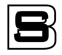
The one thing that I found challenging was trying to organize the letters in a way where people can read SB, and also keep to the rules of overlapping. Working with the pathfinder tools really helped me come up with my final and different ideas.

_____________________

There were no really solutions that I found since I produced my final design in the first stages but just the fact that move the letters around and changing the typefaces was a type of solution to get to the final design.

_____________________

Technically like I said before, using the pathfinder tools really helped me get to my final. I learned what each button meant and what affect it gives off. Learning the tools for overlapping is going to be very helpful in the end.

_____________________

My final design had no color because the affect of positive and negative space in black and white looked ascetically good. I wanted the S dominate compared to the B, so I made the weight of the S thicker. The B is thinner and when putting the B in the middle of the S, it gave it a cool affect. The negative areas of my design are equal to the positive space in some ways. The B and the S, with this typeface have a similar shape to them and it worked out in the end.

_____________________

Harmony- with the two letters together, they produce rhythmic spacing. They are similar shapes and they work well together. The B is well proportioned with the S.

_____________________

Variety- I used good use of contrast in the design. With using the pathfinder effect, it gives off a good visual grouping with the center of the B being white.

_____________________

Balance- if you cut my design in half, it would almost be the same on both sides. It is well symmetric. The overall shape of my design is a square, and a square is well balanced on both sides.

_____________________

Proportion- In relationship to each other, the two letters work with one another well. The balance and size differences between them make them proportioned.

_____________________

Movement- Here, the S is dominant compared to the B. I wanted readers to look at the S first and then move into the middle of the logo to see the B next. With the shape of the S and how when it ends both on top and on bottom, your eyes can’t help but go to the center of it. It conveys my overall logo and message well.

_____________________

Economy- In the end, my overall message of the S being before the B is conveyed well. Even if you look at the B before the S, the S still stands out as being the dominant letter.

_____________________

I really enjoyed doing this project. I think I produced a well design logo that I can use in the future for my company. The process of this project went very quickly for me, but I did produce a well design logo that I am proud of. I just recently used this logo next to my name on my resume, and I got very good feedback.

Project 3-CoLoR


Every project incorporates color, and that was our next challenge was to take the final design and add color. My teacher told me that I did have to add color if I didn't want to but I just wanted to add something to see what it looked like. In the end, I would never use this logo with color, I would just keep it in black and white. Here is the logo, but I personally hate it with color, oh well!

Project 3-FINAL


I realized out of those three thumbnails/roughs that I had, I didn't like any of them. None of them spoke to me so I took one of the them and revamped it. Reinvented the size and proportion of the letters. It is the same typeface and the S is the same size but the B has been downsized. Well, here is the final logo!

Project 3-Comps/thumbnails

With every project, the next step is to create thumbnails or comps. All your ideas in a rough sense. Well, as I expressed earlier with the other projects, I like to go straight to the computer rather then on paper. With this project, it was difficult to draw it out anyways. So down below are my first three ideas for this project!

Project 3- Logo Design Using Conjoined Letterforms

Yes, project 3 is here! This project dealt with more of a logo design rather then a composition design. What my challenge was, was to design a logo with my initials of my name which are SB if you don't already know (haha). I have to create a black and white logo that is the result of conjoining the letters into one graphic. Yes, one graphic...interesting I know. I have to use a palette of a 6 by 6 inch square to fit the logo in.

To me a logo or a logotype expresses a message that you want to communicate to the audience in a small scale sense. Here, I wanted to choose a typeface and a way to arrange my initials so it says something about me and is also legible as well. (This is going to be hard :()

Monday, April 19, 2010

Project 2-Process Journal

First, I choose three words that I knew I could do a good design with and also words that I knew the meanings, tension, liquid and itchy. Once I choose the words I went to a dictionary and looked them up. Yes, I know what they mean but dictionaries give you more of a fuller definition then what you know. It also gave me examples with my word in it and right away I got ideas in my head. In the end I just wanted to convey my design as the word, not the word as the design. It was hard to think of designs that were legible and that made sense.

______________________________________

With communicating a message, what you say is the denotation. The way it is said is the connotation. It is part of an emotional outreach and effect that you are receiving and giving to the audience.

______________________________________

With connotation and denotation, they relate to design as a whole. What you are telling the audience directly is denotation. With this project, I used tension as my final and when I say I did tension, I am directly telling the audience that this is what I chose, and this is the direct word. Connotation is where silence comes in. The audience looks at a design and comes up with a meaning in their own head. How it is placed and designed gives a certain message to people.

______________________________________

In the beginning of this project, I went for the definitions of the words before even considering sketching or designing. Like I said, I went to the dictionary to get a clear definition and a different meaning other then the one I had in my head of the word. I went off from there, using certain words that I got out of the dictionary to help me process my ideas into a design. I am more of a computer person when it comes to sketching and doing thumbnails. I did sketch a little for this project but mostly I changed all my designs once I was on the computer. Moving things around, changing size, font and etc., helps me design.

______________________________________

When I was designing on the computer was when I thought of solutions to my designs. I think better and design better on a computer rather then sketching everything out. You can easily just change things around compared to erasing things on paper.

______________________________________

One thing that was challenging with this project was the overall message that I was trying to convey to the audience. It was difficult to design something that in the end you didn’t know if your idea was being conveyed correctly. Trying to make something legible is always a struggle; cause if it’s not legible then your design is destined for tragedy. Also just thinking of ideas that would work and that would be easy to understand in the end.

______________________________________

Some of the solutions that I came up with that always helps me get to my final design are little things on the computer. That can include, font size, rearranging things, using certain effects, height, width of the letters, different colors and etc. There are so many things that I did during the process with my designs that helped me get to the final.

______________________________________

There are certain things that I learned through this process and project. I learned that emotion is a big factor in the end. This project really focused on emotion and the overall attitude of the audience. If the audience doesn’t feel the tension that you are trying to convey with the word tension, you failed. Also I learned that you have to go outside the box. With some of these words, you can easily do a simply design but in the end you have to stand out. I learned some effects in Illustrator while doing this project. With every project I learned new things and new buttons and sort cuts.

______________________________________

In the end I am not satisfied with my design. I missed the last class with the class gives you critique which is what I wanted in order to go through the process of what to change and what not to do. I could have designed it better, spent more time on my other designs.

Project 2-COLOR :)


Like project 1, I had to choose one design and put color in it, which made me really happy :))) Basically the class choose for me to use the tension one even though I personally liked the itchy design better but o well. It was hard choosing the right color or colors for this composition. I didn't want to use to much color, because that wouldn't work with the word 'TENSION' you know? I went to my dark evil side and choose.....red.

Project 2-COMPS!

After figuring out with my sketches what I wanted to do with my three designs with the three different words, I did my comps. in Illustrator. You can tell that I had trouble with the word liquid and that is mainly because all of my ideas never really ended up well in Illustrator (haha). But hey, at least I am happy with my other two designs! HERE THEY ARE!!!


Project 2- Sketches


Yes I am a bad drawer but hey, at least I sketched some things out! Here they are!........reminder I choose the words, liquid, tension and itchy.

Project 2- Designing with Letters

So, project 2 is here! My next challenge included working with a word(s). Not just any word, a word that has a connotation behind it. For example, furious or serene. Words with actions and meaning. Challenge was to communicate what the word means through a design or letters and incorporate the actual word in the design as well. My composition had to be in a 8 by inch field in Illustrator, and the design has to be black and white. NO EFFECTS. The three words that I choose was liquid, tension and itchy. Next challenge SKETCHING! :)

Wednesday, April 14, 2010

Project 1-FINAL!


So, I liked all of my roughs so I really never change them around to much. I just wanted to organize them in a way that everyone can see them, so here they are!

Project1-COLOR!


So my next challenge with project 1 was to take one of my designs and put color in them. I was so excited about this because I can not stand working with just black and white, way to boring. So, I picked my J design, and here it is! Hope you like it!

Project 1-ROUGHS!

So in my last post I was kidding about having roughs (slow chuckle). Anyways I went straight to the computer, Illustrator that is. I choose the letters of M, J and Y. Very difficult letters I know, I'm crazy. It took me a while but here they are!!! :)


Project 1-One character composition

So my classes very first project was called one-character composition, sounds interesting I know. So, our challenge was to choose 3 letters to make a graphic design composition. Each letter was going to be placed on a 6 by 6 inch square pallet and then make an interesting eye pleasing design with just that letter. We could 'experiment with effects of gravity, weight, tension, perspective, movement, positive and negative space and play with different parst of the letter or character serif stroke, shoulder, terminal, tail and counter....many different aspects and ways to create a great design! Also the next challenge was keeping everything in black and white and creating something that created some sort of pattern. WE COULD NOT STRETCH OR DISTORT THE LETTERS! that was a big no no! So my next challenge was sketching things out, putting my creative ideas on paper. Next post my roughs!

About me!


Hello blog world my name is Sara and this is the first time I am doing a blog. I am mainly just doing this blog for my typography 1 class. We are required to have a process journal that organizes all of our work through out the semester. I am going to use this blog for it! Hopefully this turns out well, not sure exactly how to use this but bare with me!